Components with dynamic attributes
By Tracey Onim | Posted 2022-08-01
Learn how you can support dynamic attributes when using reusable components with assigns_to_attribute/2 function.
I’m quite sure most of you have already interacted with live view components. You may have created components to reuse in your live view application. However, sometimes you may feel stuck when creating reusable components more so when you want to pass in common attributes with different values in your component’s markup.
For example, lets say that I have a component markup that generates something like this:
<div>
  <div class="column bg-green">
    learn dynamic attributes
  </div>
</div>
In the component there is a class HTML attribute assigned with column and bg-green values. But the component is supposed to be reusable and when I use it somewhere else, I may want a "yellow" background. That means I should set a bg-yellow class.
<div class="column bg-yellow">
I’ll show you exactly how to build the re-usable component we need in an example application akin to Kanban that can help users plan their weekly tasks.

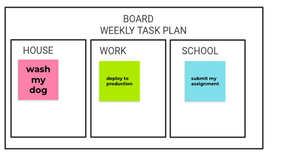
From the above image , I have split the board into 3 columns–the “house”, “work”, and “school” columns. The user interacting with this board can add weekly tasks they are supposed to do to each column.
You will also notice that each column has a card of different color. I want us to use reusable components to implement these cards in our LiveView application. The board will act as the parent live view while the card will be the component.
We want the cards in each section to have different colors. So, how can we leverage the same reusable component in each column, when the card should be a different color each time?
We can achieve this with the help of dynamic component attributes and the assigns_to_attributes/2 function.
Let’s begin:
1.Create Board live view
defmodule SampleWeb.BoardLive do
  use  SampleWeb, :live_view

  def mount(_params, _session, socket) do
    work_cards = [
      %{task: "deploy to production", id: "#{1}-work"},
      %{task: "code challenge", id: "#{2}-work"},
      %{task: "plan community events", id: "#{3}-work"}
    ]

    house_cards = [
      %{task: "wash my dog", id: "#{1}-house"},
      %{task: "sweep the house", id: "#{2}-house"},
      %{task: "tidy my bedroom", id: "#{3}-house"}
    ]

    school_cards = [
      %{task: "group discussion", id: "#{1}-school"},
      %{task: "submit assignment", id: "#{2}-school"},
      %{task: "work on school project", id: "#{3}-school"}
    ]

    {:ok,
     assign(socket, work_cards: work_cards, house_cards: house_cards, school_cards: school_cards)}

  end

  def render(assigns) do
    ~H"""
    <h1>Board</h1>
    <h2>Weekly Board Task </h2>
    <div class="row">
      <div class="column">
        <h3>Work</h3>
        <%= for card <- @work_cards do %>
          <.card card={card} />
        <% end %>
       </div>
       <div class="column">
         <h3>House</h3>
         <%= for card <- @house_cards do %>
           <.card card={card} />
         <% end %>
       </div>
       <div class="column">
         <h3>School</h3>
         <%= for card <- @school_cards do %>
           <.card card={card} />
         <% end %>
        </div>
      </div>
    """
end

def card(assigns) do
    ~H"""
    <div>
      <div class="column">
        <%= @card.task %>
      </div>
    </div>
    """
  end
end
I have created a BoardLive page that renders each card component for house, work and school section.
Here, I’m iterating over the card structs in socket assigns. For each card struct, I’m rendering the details of that card with the help of the card/1 function components. Function components are functions that take in some assigns and return some HEEx markup. They are useful for reusing markup in our LiveView applications.
Note: I’m not getting into the details of how the user should add their weekly task. In this example I have hard-coded the task assuming that the user had already added their task. We are actually displaying the task added to the cards .
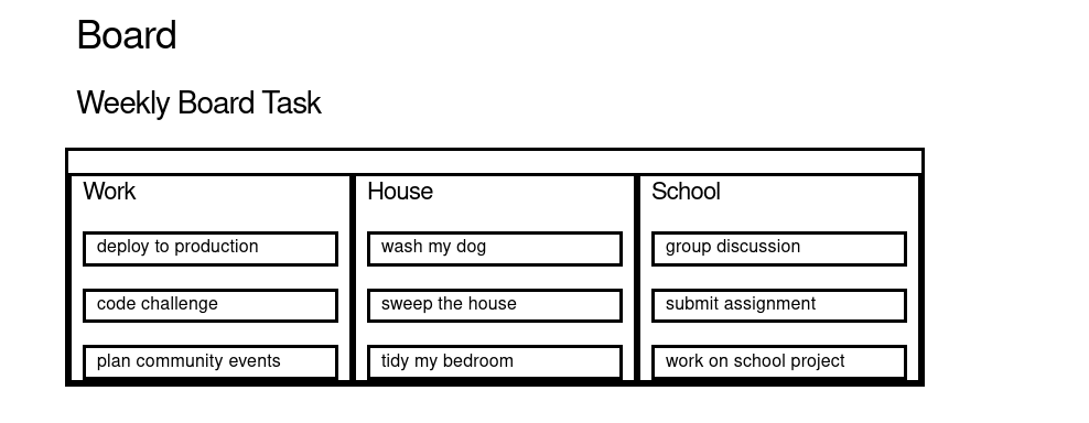
Our weekly planning task board should look something similar to this when we open our browser:

2.Problem: Reusing components with different attributes
-
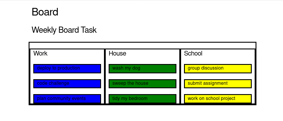
We want the cards in each column to have a different color from one another . For example, cards in the “work” column should be blue, cards in the “house” column should be green, and cards in the “school” column should be yellow.
-
We should be able to use the same
card/1function component we defined earlier, while still ensuring that cards can be a different color in the different columns.
We could solve the first problem like this:
    <div class="row">
      <div class="column">
        <h3>Work</h3>
        <%= for card <- @work_cards do %>
         <div>
          <div class="column bg-blue">
            <%= card.task %>
          </div>
         </div>
        <% end %>
       </div>
       <div class="column">
         <h3>House</h3>
         <%= for card <- @house_cards do %>
           <div>
            <div class="column bg-green">
             <%= card.task %>
            </div>
          </div>
         <% end %>
       </div>
       <div class="column">
         <h3>School</h3>
         <%= for card <- @school_cards do %>
          <div>
           <div class="column bg-yellow">
            <%= card.task %>
           </div>
         </div>
         <% end %>
        </div>
      </div>
We have solved our first problem , its working but this code has some shortcomings. Personally, its redundant to write the same <div> markup over and over again and this is the reason why we opted to use function components in the first place. However, our original implementation doesn’t allow us to control the color of the cards in each column.
How can we solve this problem?
3. Solution: Dynamic Component Attributes with assigns_to_attributes/2
Luckily, Phoenix LiveView v0.16.0 introduced the assigns_to_attribute/2 function.
This function is useful for transforming caller assigns into dynamic attributes while stripping reserved keys from the result.
assigns_to_attribute/2 takes in assigns as the first argument and a list of assign’s keys that are to be excluded as the optional second argument. Then it returns a filtered list of keywords for use as HTML attributes.
Now that we are assured we can transform the assigns passed to card/1 into HTML attributes, let’s go ahead and add an assigns of "class" to our call to card/1. We’ll give that assigns a value of "bg-*". “bg-*” represents background color with a CSS added property.
<h3>Work</h3>
<%= for card <- @work_cards do %>
   <.card card={card} class={"bg-blue"}/>
 <% end %>
<!--- ... -->

 <h3>House</h3>
 <%= for card <- @house_cards do %>
   <.card card={card} class={"bg-green"}/>
 <% end %>
<!--- ... -->

<h3>School</h3>
<%= for card <- @school_cards do %>
  <.card card={card} class={"bg-yellow"}/>
<% end %>
Inspect the assigns and see what it holds:
def card(assigns) do
IO.inspect(assigns, label: "==================card component=====")

~H"""
    <div>
      <div class="column">
        <%= @card.task %>
      </div>
    </div>
    """
  end
 output:
==================card component=====: %{
  __changed__: nil,
  card: %{id: "1-work", task: "deploy to production"},
  class: "bg-blue"
}
We can see the assigns contains the card and the class assigns. Let’s go ahead and invoke the assigns_to_attribute/2 inside the card/1 to transform our class assignment for use in a <div> tag attribute.
def card(assigns) do
extra = assigns_to_attributes(assigns)
# ...
end
If we invoke assigns_to_attributes/2 with the assigns, it returns a list of keywords as shown:
[
  card: %{id: "3-school", task: "work on school project"},
  class: "column bg-yellow"
]
We don’t want to use the card assign as an HTML attribute so we will have to exclude it from the list and only remain with the class assign.
def card(assigns) do
extra = assigns_to_attributes(assigns, [:card])
assigns = assign(assigns, :extra, extra)
~H"""
    <div>
      <div {@extra} >
        <%= @card.task %>
      </div>
    </div>
    """
end
Here I have updated our assigns with the HTML attributes contained in extra using the assign/2 function. So we can use the @extra assignment to output HTML attributes on the <div> tag.
Note: The class assignment should also contain the “column” class, along with the "bg-*" class, as shown below.
<.card card={card} class={"column bg-green"}/>This is how our rendered markup looks like when you inspect it in the browser:
<div>
  <div class="column bg-green">
    wash my dog
  </div>
</div>

Conclusion
So far, we’ve seen how we can support dynamic attributes in components using assign_to_attributes/2. This function is useful when you want to incorporate creating reusable components in your application, because it can give us control over HTML attributes that we pass in the component’s markup.